Cartographic visualizations @ Twitter
During my time with the Dataviz team at Twitter, I built a few visualizations to a show tweet patterns, trends and follower growth impact.
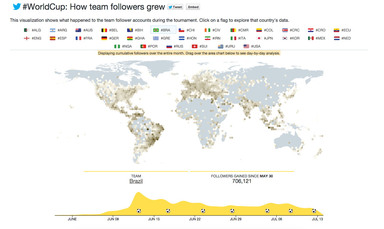
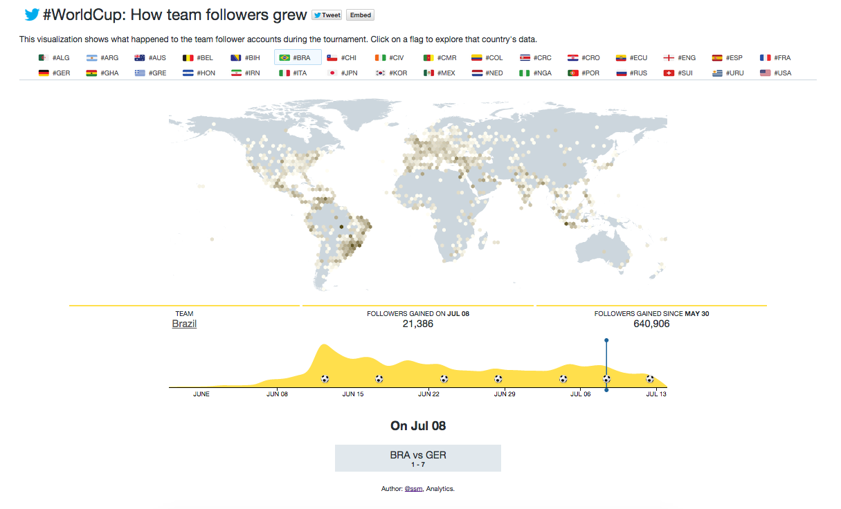
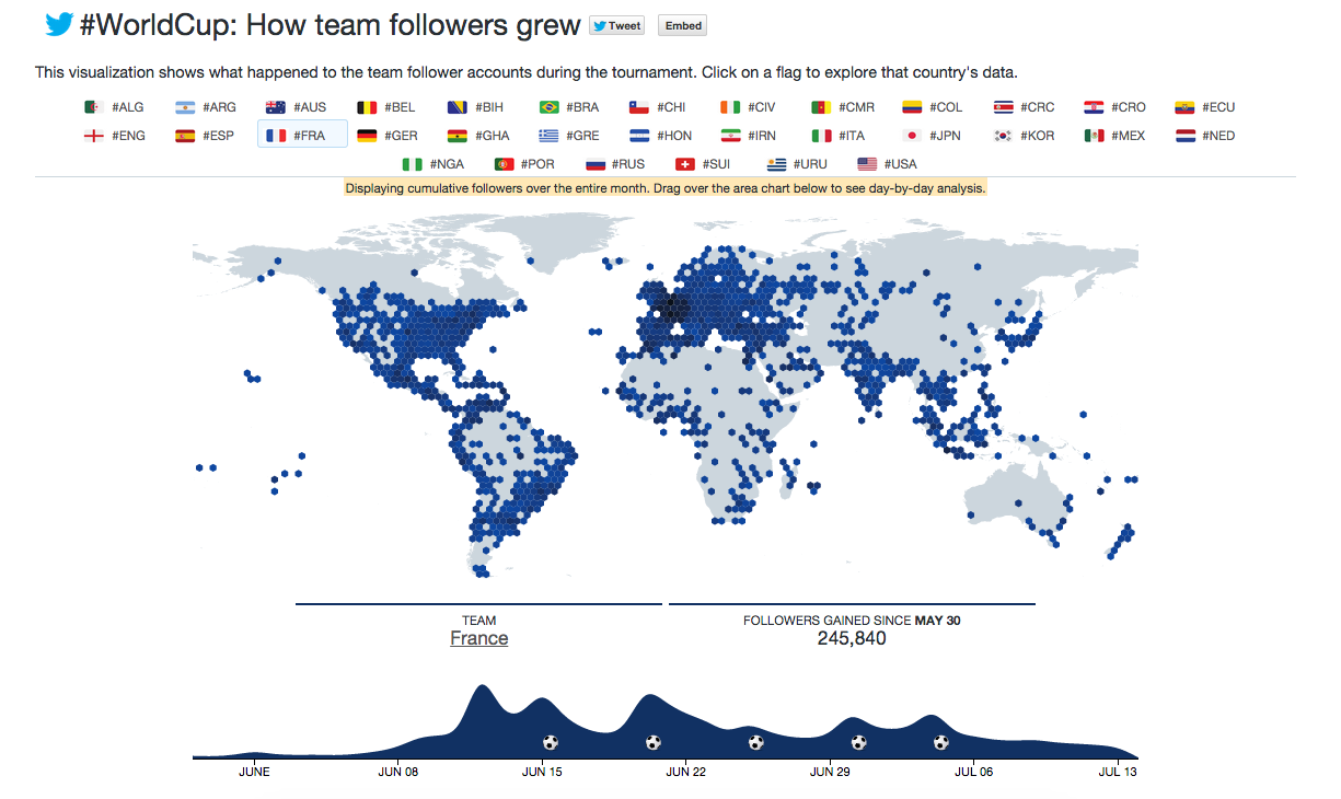
Team Follower Growth during the 2014 FIFA World Cup
One such example was building the 2014 FIFA World Cup official team follower growth visualization over time, correlated with the games that team played:
This visualization was published on Twitter’s interactive portal. Twitter’s interactive portal (http://interactive.twitter.com) features the largest collections of some of the world’s most complex and beautiful data visualizations built using Twitter’s data.
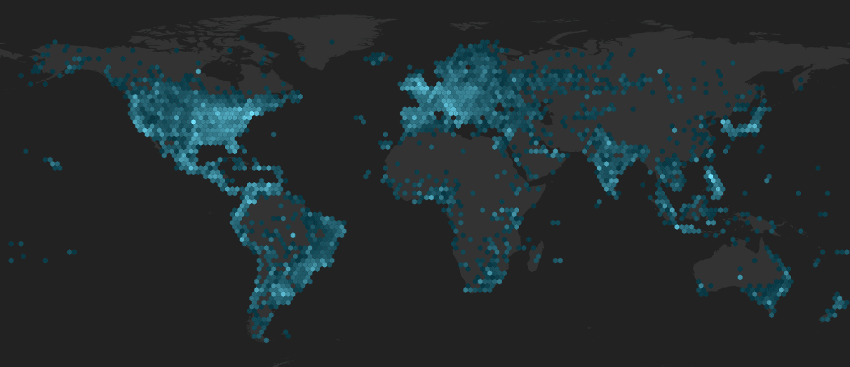
This viz displayed 25 billion raw data points aggregated over hexagonal bins.

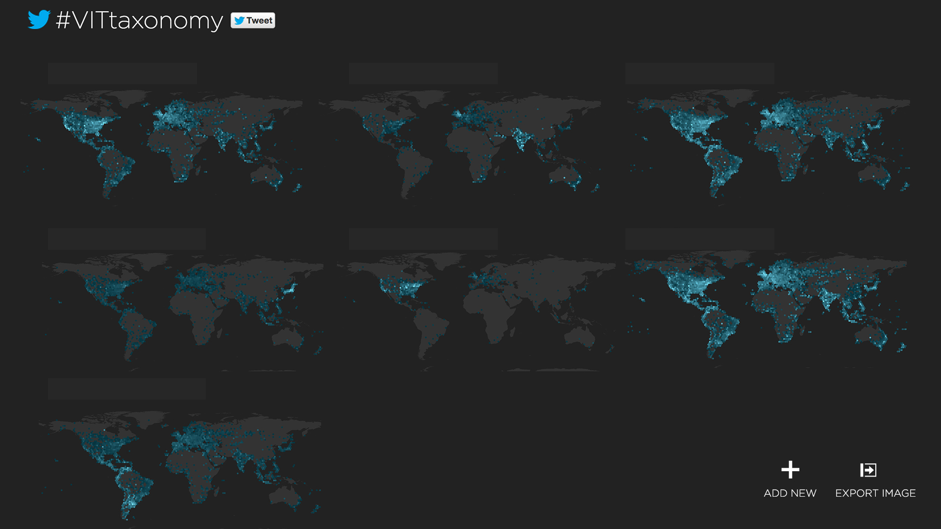
Later I also exported this work as an internal tool for visualizing data.