Uplevel - security observability visualizations
Design, visualization and usability’s impact on cybersecurity operations
I joined Uplevel Security over a year ago. Since then I’ve been working on exploring different ways to express intelligence through visuals. My background is in computer science and visual design and I love creating computational art, visualizing data, designing higher dimensional games and engineering products.
Modern security operations are lagging behind in the design and visualization revolution occurring in the tech industry. Our mission at Uplevel is to show how good design practices coupled with Uplevel’s graph can radically transform the way security teams interact with data on a daily basis. Here are some of the visualization practices that we at Uplevel follow:
Visualizing complex data
Manually reviewing security alerts to extract intelligence from noisy data can be a mundane task. Most security teams rely on information gathered from multiple security appliances, which further amplifies the noise. This makes understanding security data a slow, complex and monolithic task.
At Uplevel, we use a graph-data structure that evolves into a contextual system of record and intelligence used to inform future threats, and improve the efficiency and efficacy of security teams. This solves part of the problem by ingesting and aggregating data from multiple sources into a single place. However, this data structure is still intrinsically complex, and optimizing it for visual consumption poses a few challenges. Visualizing and presenting intelligence derived from the Uplevel graph has been one of the most intellectually stimulating projects I’ve worked on with the team.
While visualization is a great tool, it is often misused or overused, resulting in an increase in cognitive complexity.
The above visualization from The Washington Post/ABC is a classic example of over-visualizing data that results in increased visual ambiguity. For the sake of brevity, let’s only look at the pie charts. At a glance, the proportions in the small-multiple pie charts are almost indiscernible from each other. It is apparent that this information would’ve been much easier to consume if the pie charts were replaced by a simple percentage value.
Abstract vs Actionable Visuals
A complex data structure, like a graph, can significantly increase the complexity of interpreting data. The data visualizations that we create at Uplevel usually fall into two categories: abstract or actionable. Both are effective when used strategically.
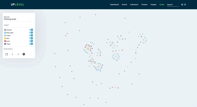
Abstract visualizations are those that are generally used to paint a bigger picture. They summarize large data sets over extended periods of time, and provide various metrics such as the efficiency of security teams or the time to remediate incidents. The intended audience for such visualizations is usually project managers, team leaders or CISOs who might use these metrics to further improve the efficiency of their teams.
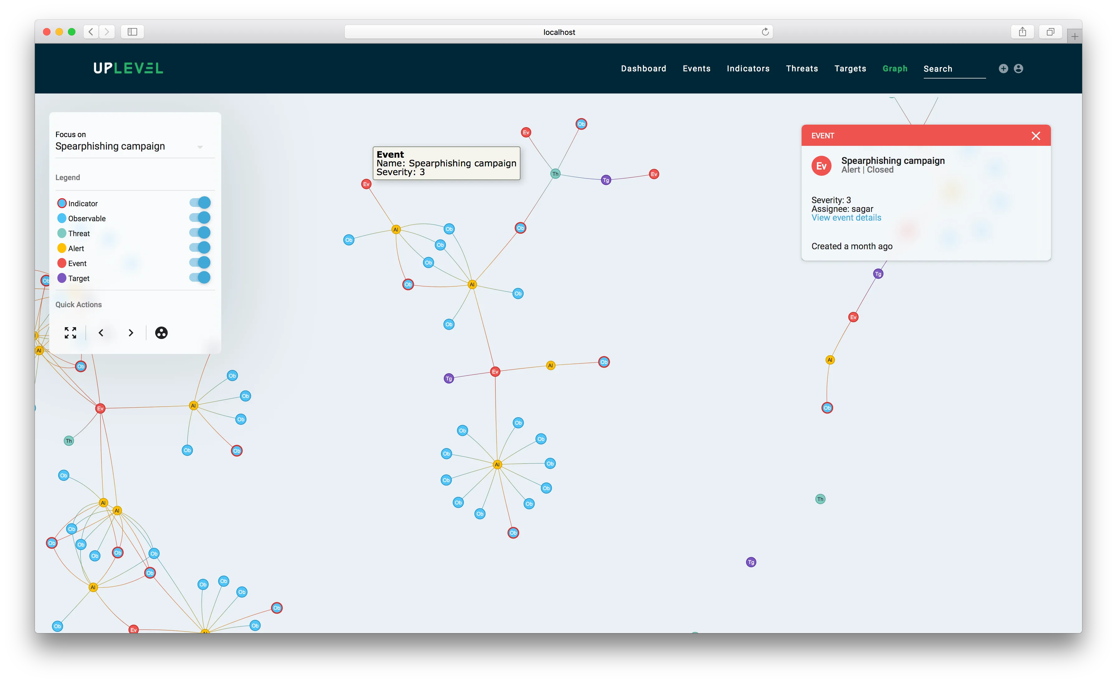
Here is an example of a visualization of a subset of a large graph in our platform:
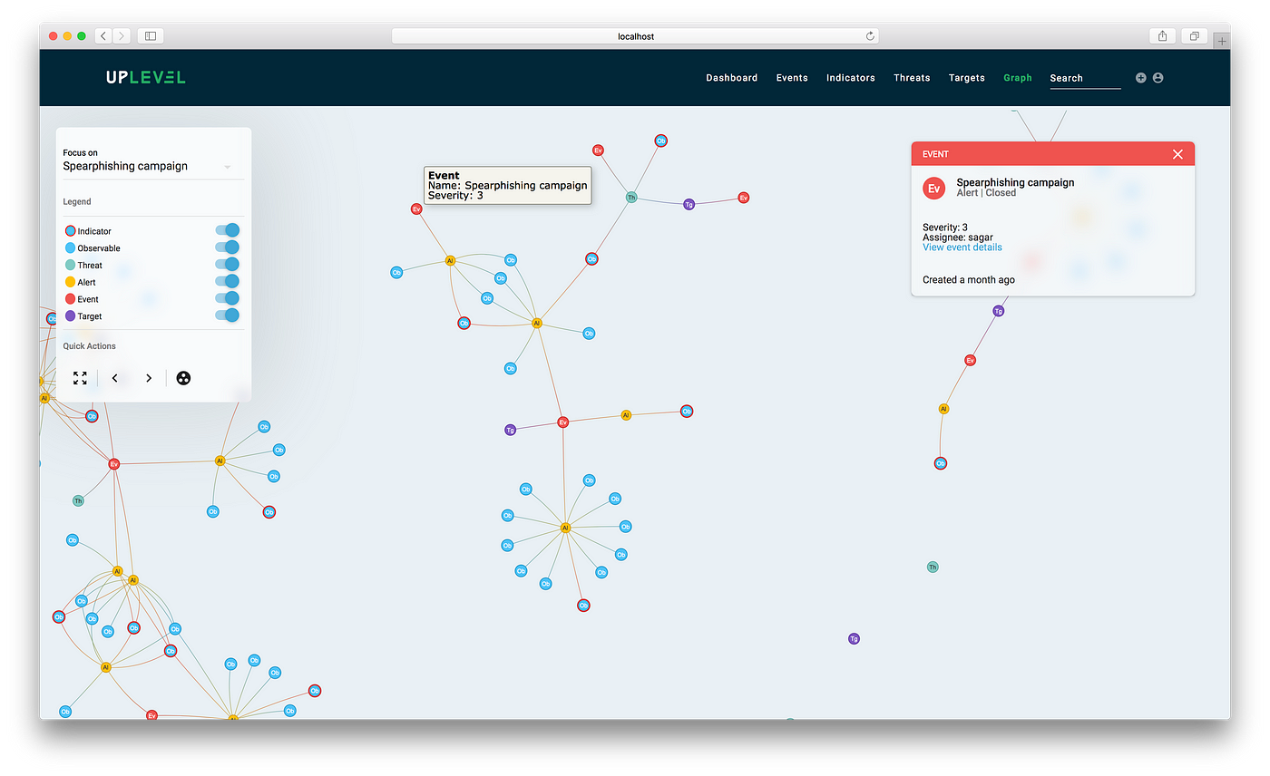
In this case, the actual graph data structure contains 601 nodes and 1179 edges, whereas the visualization in the picture contains 140 nodes and 139 edges (including nodes not in view). This is because we simplify the graph to maximize discernibility by removing a lot of information that is generally required for computing intelligence, but is often extraneous to analysts.
This makes querying the graph visually much easier. The resulting, simplified data structure minimally summarizes graph connectivity and sophistication of attacks over time, and provides analysts with the ability to identify and dive into specific malicious artifacts to remediate them.
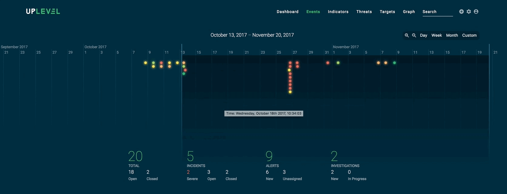
Here is another example of an abstract visualization that shows how analysts can easily compute metrics based on a given time frame:
Actionable visualizations, on the other hand, directly complement a security analyst’s decision-making process. In the example below, we isolate an artifact tree from the overall graph structure and visualize it in a familiar collapsible manner, so analysts can delve into the context and hierarchy of malicious artifacts and indicators as necessary.
To visualize or not to visualize?
I’ve come to realize that in most cases, the answer to the above question is not to visualize. At Uplevel, we prefer a reductionist approach to data visualization. It’s true that a lot of information can be expressed through a visual, but in most real-world scenarios the need for expressing large amounts of information actually does not exist. From our findings, security analysts care more about seeing information relevant to their investigation rather than manually sifting through all the available data. So creating a data visualization containing all information is not validated in most cases.
A reductionist approach to data visualization also pushes us to design more context-aware interfaces. Cybersecurity data highly depends on the context of occurrence and ingestion; and showing information for every attribute of every single datum means analysts end up spending a lot of time processing this information. So instead of trying to compress all the data into a single visualization, we determine the context surrounding a data artifact and selectively make it the focus of attention. Let me be very clear here — the idea behind the reductionist approach is not to discourage the use of data visualizations, but rather to build more effective visualizations and reduce complexity. After all, a user interface is just another form of visualization.
Moving towards context-aware interfaces
The first step in designing a context-sensitive UI is to define the context. In our case, we define the relevant context by:
- Computing context trees for each alert at the time of ingestion, and
- Measuring analysts’ interactions at the time of investigation.
The second step can, and should, involve both qualitative as well as quantitative research on the usability of an existing UI. Our UX research team is largely responsible for this part of the process. We utilize context to prioritize the presentation of information to analysts.
The artifacts associated with an incident are smartly populated depending on a dynamic precedence order of importance:

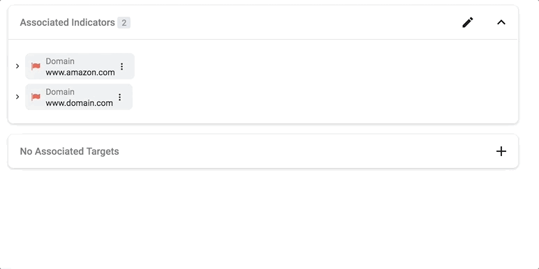
For this incident, the associated indicator is more relevant than other types of associations.

Whereas for this alert, the associated threat actor has precedence over an indicator.
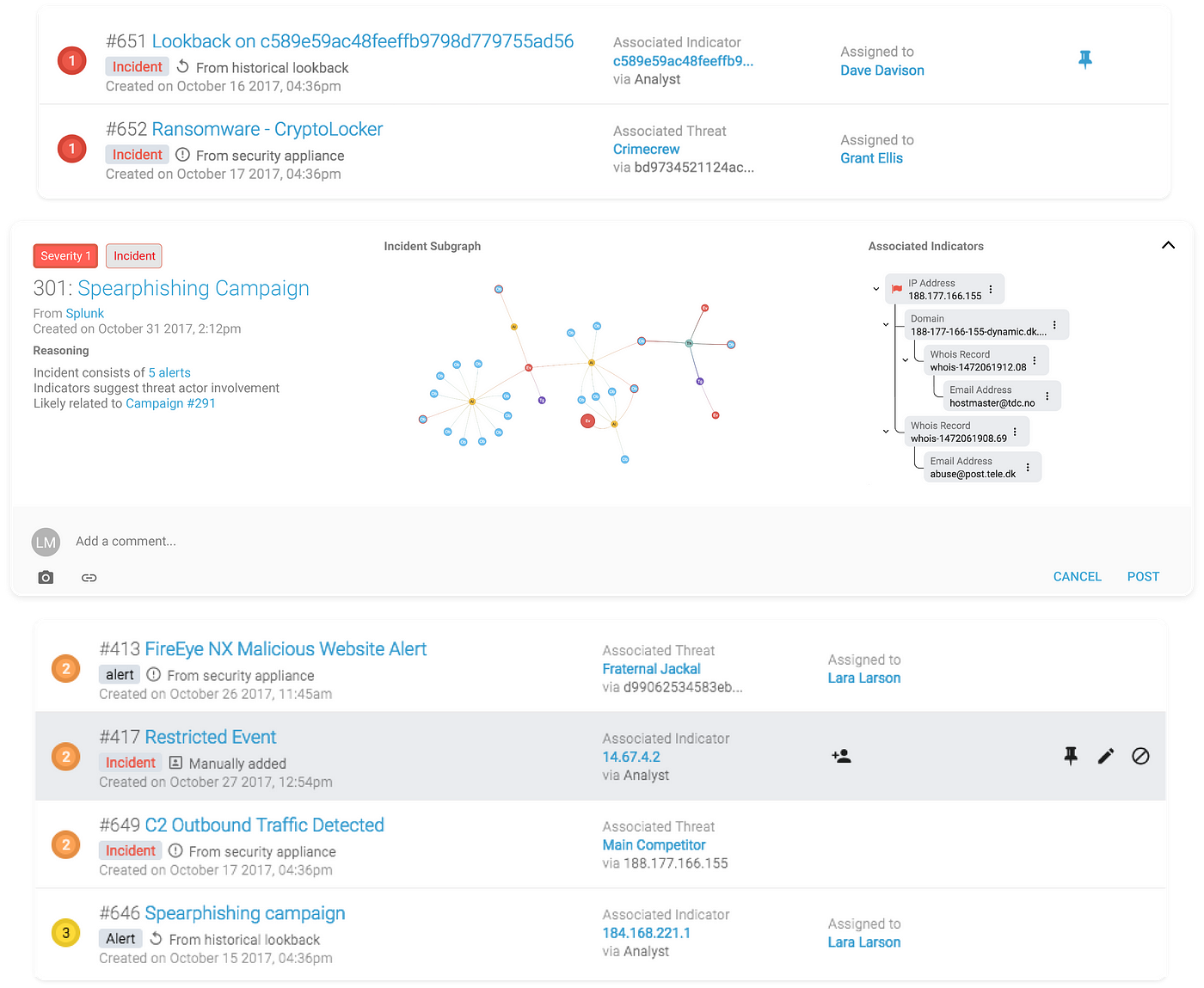
The analyst always has the option to click through and see a complete summary of all the associated artifacts. There are also situations where the context of an ingested threat actor might need to be displayed:
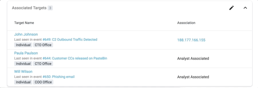
The list of associated targets also displays the name of the event where the target was last seen.
We also make our system as transparent as possible by exposing Uplevel’s reasoning for certain escalations:
Less truly is more
Designing an interface is a process that never ends. The main takeaways for us, from our explorations in design, are:
- Recursively reducing the complexity of data by summarizing and contextualizing it at every level actually ends up conveying more usable information than displaying raw data.
- For a system that learns and evolves over time, the visuals should merely serve as means of expressing the underlying intelligence and context.